Design Standards Ecommerce Best Practices

Mastering Design Standards for Ecommerce: Best Practices for Conversion and User Experience
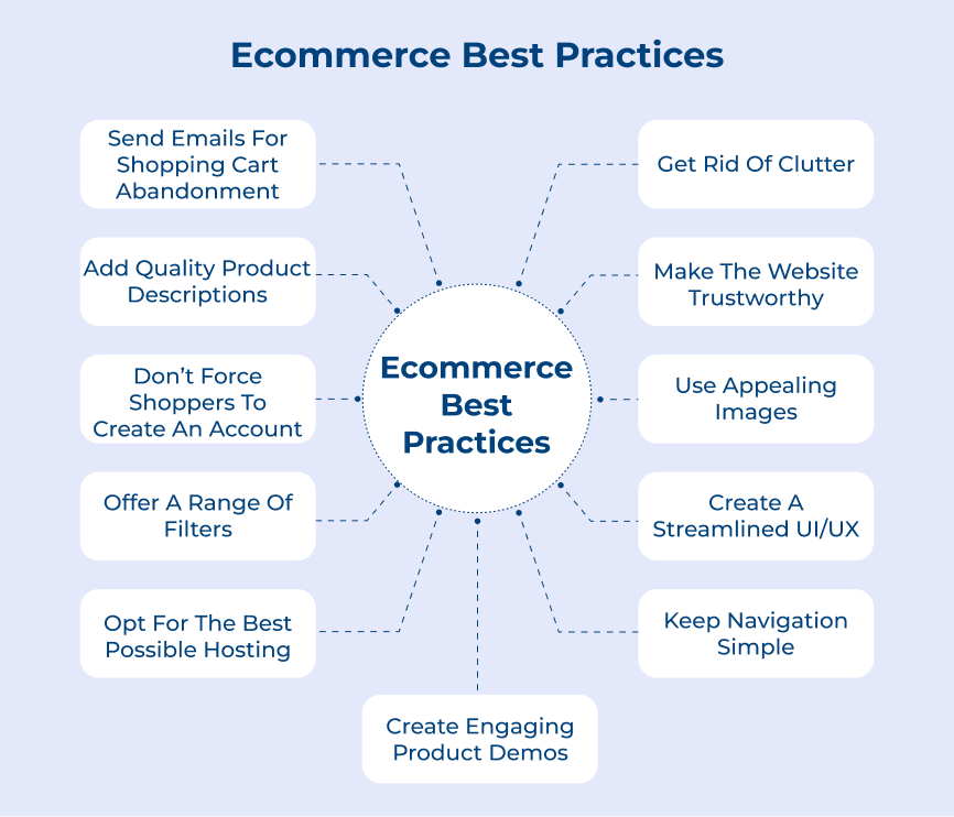
Ecommerce design standards are not merely aesthetic preferences; they are foundational elements that directly impact user experience (UX), trust, and ultimately, conversion rates. In the competitive digital marketplace, a well-designed ecommerce website is a critical differentiator. This article explores key design standards and best practices essential for building high-performing online stores, focusing on elements that drive engagement, simplify navigation, and foster customer confidence.
1. Visual Hierarchy and Information Architecture
A fundamental design standard in ecommerce is establishing a clear visual hierarchy. This means guiding the user’s eye through the page in a logical order, prioritizing the most important information and calls to action. Key elements like product images, prices, "Add to Cart" buttons, and promotional banners should be prominent and easily discoverable. This is achieved through strategic use of size, color, contrast, and whitespace. Information architecture (IA) is the underlying structure that organizes content, making it accessible and understandable. For ecommerce, this translates to intuitive site navigation, logical product categorization, and effective search functionality. A well-defined IA ensures users can find what they’re looking for quickly, reducing frustration and bounce rates. Consider the user journey from landing page to checkout: each step must be clear, and the path frictionless. This involves thoughtful menu design, breadcrumbs for orientation, and a consistent placement of essential elements like search bars and shopping cart icons across all pages.
2. User Interface (UI) Consistency and Brand Cohesion
Maintaining UI consistency is paramount for building trust and a recognizable brand identity. This encompasses the consistent application of brand colors, typography, button styles, and overall layout across the entire ecommerce platform. Inconsistent design elements can create confusion, erode credibility, and make the site feel unprofessional. For example, if a "Buy Now" button appears in different colors or shapes on different product pages, users may become hesitant. Brand cohesion extends beyond the visual. It involves reflecting the brand’s personality and values through every design element, from the tone of the copy to the imagery used. This creates an immersive brand experience that resonates with the target audience and fosters loyalty. Designers should develop a style guide or design system that dictates all visual and interactive elements, ensuring adherence across all web and mobile interfaces.
3. High-Quality Product Imagery and Video
In ecommerce, product imagery is the virtual salesperson. High-resolution, professional product photos and videos are non-negotiable. Images should showcase products from multiple angles, highlight key features, and provide context (e.g., lifestyle shots showing the product in use). Zoom functionality is essential, allowing customers to scrutinize details. Video content can further enhance engagement, demonstrating product functionality, benefits, and even customer testimonials. Poor-quality, pixelated, or generic imagery will immediately signal a lack of professionalism and can deter potential buyers. Optimize image file sizes for fast loading times without sacrificing quality. Alt text for images is also a critical SEO component, providing descriptive text for search engines and visually impaired users.
4. Clear Calls to Action (CTAs)
Effective CTAs are the engine of conversion in ecommerce. They should be visually distinct, compelling, and clearly communicate the desired action. Use action-oriented language (e.g., "Add to Cart," "Shop Now," "Sign Up," "Learn More"). The color, size, and placement of CTAs are crucial. They should stand out from surrounding content but not be jarring. A common best practice is to use contrasting colors for CTAs that align with the brand palette but are more vibrant. The "Add to Cart" button, in particular, needs to be highly visible and accessible on all product pages. Consider the user’s proximity to a purchase decision when designing CTAs. For instance, "Checkout" or "Proceed to Payment" CTAs should be prominent on the cart page. A/B testing different CTA designs, wording, and placements is an ongoing process for optimization.
5. Intuitive Navigation and Site Search
A user-friendly navigation system is critical for helping visitors find what they need efficiently. This includes a clear main navigation menu, logical product categorization, and effective filtering and sorting options. Mega menus can be beneficial for sites with a large number of products, allowing for more detailed categorization. Breadcrumbs are essential for helping users understand their current location within the site hierarchy and navigate back easily. Site search is an equally vital component. An effective search bar should be prominently displayed and offer features like autocomplete, type-ahead suggestions, and robust search algorithms that handle misspellings and synonyms. Users who utilize site search are often highly motivated to purchase, so a poor search experience can lead to significant lost revenue. Implementing faceted search, allowing users to refine results by attributes like price, brand, size, and color, further enhances the search experience.
6. Mobile-First Responsive Design
With the majority of online shopping now occurring on mobile devices, a mobile-first responsive design approach is no longer optional; it’s a fundamental requirement. This means designing for the smallest screen size first and then scaling up for larger displays. Mobile users have different expectations and interaction patterns. Buttons need to be tappable, content easily readable without excessive zooming, and forms simple to complete. Responsive design ensures a seamless experience across all devices, from smartphones and tablets to desktops. Google’s mobile-first indexing prioritizes mobile versions of websites for search rankings, making this a crucial SEO consideration. Implementing touch-friendly elements and optimizing for fast mobile loading speeds are key aspects of this standard.
7. Streamlined Checkout Process
The checkout process is where many potential customers abandon their carts. A complex or lengthy checkout can lead to frustration and lost sales. Best practices include minimizing the number of steps, offering guest checkout options, clearly displaying shipping costs and estimated delivery times early on, and providing multiple secure payment options. Progress indicators can help users understand where they are in the checkout flow. Auto-filling forms where possible and ensuring a secure, trustworthy environment are also critical. Minimize distractions during checkout; remove unnecessary navigation or promotional elements. The goal is to make purchasing as quick, easy, and secure as possible.
8. Trust Signals and Security
Building trust is paramount in ecommerce, as customers are entrusting businesses with their personal and financial information. Prominently displaying trust signals such as SSL certificates, secure payment badges (e.g., Visa, Mastercard, PayPal), customer reviews, testimonials, and clear return/refund policies can significantly increase confidence. A professional and error-free website design also contributes to perceived trustworthiness. Ensure contact information is easily accessible, further reinforcing transparency. Security seals and visible indicators of secure transactions reassure customers that their data is protected.
9. Whitespace and Readability
Effective use of whitespace (or negative space) is a critical design standard that enhances readability and visual appeal. It prevents content from appearing cluttered and overwhelming, allowing users to focus on key elements. Sufficient line spacing, paragraph breaks, and margins around images and text improve comprehension and reduce eye strain. Typography plays a crucial role here. Choosing legible fonts and appropriate font sizes for body text and headings is essential for a positive user experience. Consistent font usage throughout the site reinforces brand identity and improves readability. Avoid overly decorative or small fonts for important information.
10. Accessibility Standards (WCAG Compliance)
Designing for accessibility is not only an ethical imperative but also a legal requirement and a smart business practice that expands your customer base. Web Content Accessibility Guidelines (WCAG) provide a framework for making web content accessible to people with disabilities. This includes providing alternative text for images, ensuring sufficient color contrast for readability, enabling keyboard navigation, and providing clear labels for form fields. Websites that are accessible to all users often have better usability for everyone and can improve SEO through better structured content and semantic HTML.
11. Performance Optimization and Loading Speed
Website loading speed is a critical factor for both user experience and SEO. Slow-loading pages lead to high bounce rates and decreased conversions. Design choices directly impact performance. This includes optimizing images, minifying CSS and JavaScript, leveraging browser caching, and choosing a reliable hosting provider. Users expect pages to load within a few seconds, especially on mobile devices. Regularly testing website speed using tools like Google PageSpeed Insights and addressing any identified bottlenecks is an ongoing design and development task.
12. Personalization and User Segmentation
While not strictly a visual design element, personalization is an increasingly important design standard for ecommerce. Leveraging user data to tailor content, product recommendations, and offers can significantly enhance the user experience and drive conversions. This can include displaying recently viewed items, recommending products based on past purchases or browsing behavior, and segmenting users based on their demographics or interests. Personalized experiences make users feel understood and valued, leading to greater engagement and loyalty.
13. User Feedback Integration and Iterative Design
The best ecommerce design standards are informed by real user feedback. Implementing mechanisms for collecting user feedback, such as surveys, heatmaps, and user testing, is crucial. This data should be used to iteratively improve the design and UX. What might seem like a good design in theory may present usability challenges for actual users. A commitment to continuous improvement based on data and feedback ensures the website remains effective and user-centric. Regular analysis of user behavior metrics (e.g., conversion rates, time on page, bounce rates) can also reveal areas for design enhancement.
14. Error Handling and Prevention
Proactively designing to prevent errors and gracefully handling those that occur is vital. This includes clear form validation that informs users of errors in real-time, helpful error messages that explain how to fix the problem, and well-designed 404 pages that guide users back to relevant content. Preventative design, such as using dropdowns for selections where appropriate instead of free-text fields, can minimize user input errors. Thoughtful error handling reduces user frustration and prevents lost sales due to technical glitches.
Conclusion
Adhering to these design standards and best practices is not a one-time task but an ongoing commitment. A successful ecommerce website is a dynamic entity that requires continuous refinement based on user behavior, technological advancements, and evolving market trends. By prioritizing a user-centric approach and integrating these core design principles, businesses can create online stores that not only look appealing but also perform exceptionally, driving conversions and fostering long-term customer relationships. The investment in thoughtful, well-executed design is a direct investment in business growth and sustainability in the digital economy.


