How To Create Heatmap In Python

Mastering Heatmap Creation in Python: A Comprehensive SEO-Friendly Guide
Heatmaps are powerful visualization tools that represent the magnitude of a phenomenon as color in two dimensions. In Python, creating heatmaps is straightforward, thanks to libraries like Matplotlib, Seaborn, and Plotly. This guide will delve into the process, covering data preparation, various heatmap types, customization options, and best practices for SEO optimization.
The fundamental building block for creating any heatmap in Python is data. Heatmaps typically visualize a 2D array or a Pandas DataFrame. The values within this data structure dictate the color intensity. Before generating a heatmap, ensuring your data is in the correct format is paramount. For numerical data, this means having a consistent structure where rows and columns represent distinct categories or variables, and the intersection contains the corresponding value. For instance, if you’re visualizing user engagement across different features and days, your DataFrame might have features as rows and days as columns, with cell values representing engagement metrics.
The most common and accessible library for generating heatmaps in Python is Matplotlib, specifically its imshow function. While imshow is versatile, it often requires manual setup for labels and color bars. To illustrate, consider a simple NumPy array representing a small dataset. You would first import NumPy and Matplotlib. import numpy as np and import matplotlib.pyplot as plt. Then, define your data: data = np.random.rand(5, 5). To display this as a heatmap, you’d use plt.imshow(data, cmap='viridis'). The cmap argument specifies the colormap, with ‘viridis’ being a popular choice for its perceptual uniformity. To add a color bar, which is crucial for interpreting the heatmap, use plt.colorbar(). This bar visually maps the colors back to the data values. Finally, plt.show() renders the plot. While this provides a basic heatmap, it lacks informative labels.
For more aesthetically pleasing and statistically oriented heatmaps, Seaborn is the go-to library. Seaborn is built on top of Matplotlib and provides higher-level interfaces for creating attractive statistical graphics. The seaborn.heatmap() function is specifically designed for this purpose and offers numerous built-in features. If your data is already in a Pandas DataFrame, Seaborn integrates seamlessly. First, import Seaborn: import seaborn as sns and import pandas as pd. Let’s create a sample DataFrame: df = pd.DataFrame(np.random.rand(10, 12), index=[f'Feature {i+1}' for i in range(10)], columns=[f'Day {j+1}' for j in range(12)]). Then, generate the heatmap: sns.heatmap(df). Seaborn automatically adds row and column labels from the DataFrame’s index and columns, respectively. It also includes a color bar by default.
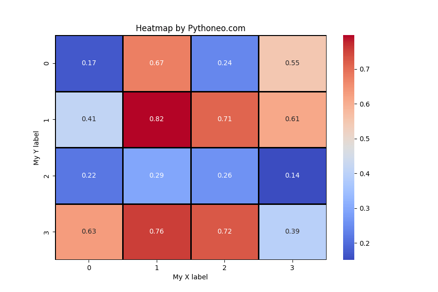
A key feature of Seaborn’s heatmap() is its ability to annotate the cells with their corresponding values. This is incredibly useful for precise data interpretation, especially when dealing with smaller datasets or when specific values are of interest. To enable annotation, use the annot=True argument: sns.heatmap(df, annot=True). You can further customize the appearance of these annotations by controlling their font size (annot_kws={"size": 8}) and format (fmt=".2f" for two decimal places). This level of detail significantly enhances the heatmap’s readability and SEO value by making specific data points discoverable.
Customizing colormaps is another critical aspect of heatmap creation, impacting both aesthetics and how effectively the data is communicated. Seaborn and Matplotlib support a wide array of colormaps. For example, to use a diverging colormap like ‘coolwarm’, which is excellent for showing deviations from a central point, you would use sns.heatmap(df, cmap='coolwarm'). For sequential data, where values increase or decrease along a spectrum, colormaps like ‘Blues’ or ‘Greens’ are suitable. The choice of colormap should align with the nature of your data and the message you intend to convey. For SEO, descriptive colormap names in comments or associated text can help search engines understand the visualization’s content.
Beyond basic heatmaps, you can create specialized visualizations like correlation heatmaps. These are invaluable in statistical analysis and machine learning for understanding relationships between variables. To generate a correlation heatmap, you first need to calculate the correlation matrix of your DataFrame. If df is your DataFrame, the correlation matrix can be obtained using correlation_matrix = df.corr(). Then, you can plot this matrix as a heatmap: sns.heatmap(correlation_matrix, annot=True, cmap='coolwarm'). This type of heatmap is highly SEO-friendly as it directly addresses common data science queries related to variable relationships.
For interactive heatmaps, Plotly offers a robust solution. Interactive plots are excellent for web-based content and can significantly improve user engagement, a positive signal for SEO. Plotly’s plotly.express module simplifies heatmap creation. Import it as import plotly.express as px. To create an interactive heatmap from a DataFrame df, use fig = px.imshow(df, labels=dict(x="Day", y="Feature", color="Engagement"), x=df.columns, y=df.index, title="Interactive Engagement Heatmap"). The labels argument allows you to customize axis and color bar labels, which are crucial for SEO. fig.show() will render the interactive heatmap.
When preparing data for heatmaps, especially for SEO purposes, consider data aggregation and transformation. If your raw data is too granular, aggregating it to a higher level (e.g., daily to weekly summaries) can create more meaningful heatmaps. Conversely, if your data is too sparse, consider binning or grouping values. For SEO, it’s beneficial to include metadata about the data, such as its source, time period, and units, either within the plot itself (if the library supports it) or in the surrounding text. This metadata provides context that search engines can parse.
The strategic use of keywords in the text surrounding your heatmap visualizations is crucial for SEO. When describing your heatmap, use relevant terms such as "data visualization," "heatmap chart," "correlation analysis," "customer behavior heatmap," "website traffic heatmap," or specific industry terms related to your data. For example, if you’re creating a heatmap of e-commerce sales by product category and region, use keywords like "e-commerce sales heatmap," "product performance by region," and "sales visualization." The title of your plot and axis labels should also be descriptive and keyword-rich.
Optimizing image formats and alt text for heatmaps embedded in web pages is another SEO best practice. When saving your Python-generated heatmaps as image files (e.g., PNG, JPEG), ensure they are compressed to reduce file size without sacrificing too much quality. This improves page load speed, a significant SEO ranking factor. Crucially, provide descriptive alt text for each image. The alt text should accurately describe the content of the heatmap and include relevant keywords. For instance, instead of alt="heatmap", use alt="Heatmap showing user engagement levels across different website features over a 30-day period.". This allows search engines to understand the image content and can also aid visually impaired users.
The choice of colormap can also indirectly impact SEO by influencing user engagement. A poorly chosen colormap can make a heatmap difficult to interpret, leading to users quickly leaving the page. Conversely, a clear and effective colormap can keep users engaged longer. For instance, using sequential colormaps for data with a clear progression and diverging colormaps for data showing deviations from a norm will enhance interpretability. When discussing your heatmap, consider explaining your colormap choice and why it’s effective for the specific data.
In the context of large datasets, sampling or binning can be necessary to create visually comprehensible heatmaps. If you have millions of data points, plotting each individually might result in an unreadable mess. Techniques like averaging values within bins or selecting representative samples can be employed. When describing these processes in your accompanying text, it’s important to be transparent about the methodology. This transparency builds trust and provides valuable context for both users and search engine algorithms.
For advanced heatmap customization, you can manipulate aspects like cell borders, line widths, and color boundaries. Seaborn’s linewidth and linecolor arguments can be used to draw lines between cells, separating them visually. For example, sns.heatmap(df, linewidth=.5, linecolor='black'). Adjusting the cbar_kws parameter in Seaborn allows for customization of the color bar itself, such as its label, orientation, and tick formatting. These fine-grained controls, when used thoughtfully, can make your heatmaps more professional and informative, indirectly contributing to better user experience and SEO.
Consider using consistent styling across multiple heatmaps within a project or on your website. This creates a cohesive visual identity. You can define custom color palettes or styling functions in Python and reuse them. For SEO, consistency in presentation makes your content more recognizable and professional. If your website features multiple heatmaps, ensuring they share a similar visual language can improve brand recognition and user familiarity.
When discussing the insights derived from your heatmaps, directly linking these insights to actionable conclusions or business decisions is crucial. This not only makes your content more valuable to readers but also provides strong contextual signals for search engines. For example, if your heatmap reveals a peak in user activity on Tuesdays, you can write, "Our analysis, visualized by the Tuesday engagement heatmap, indicates a significant increase in user interaction on Tuesdays. This engagement heatmap suggests that marketing campaigns or new feature rollouts scheduled for Tuesdays could yield higher conversion rates." The repeated use of relevant keywords in a natural and informative context significantly boosts SEO.
Finally, remember to regularly update your heatmap-related content as new data becomes available. Fresh, relevant content is a key driver for SEO. If you create a heatmap today, and the data changes next month, consider generating an updated heatmap and writing a new blog post or updating the existing one to reflect the latest insights. This demonstrates ongoing activity and provides a continuous stream of value to your audience, which search engines favor. The process of creating heatmaps in Python is multifaceted, involving data preparation, library selection, customization, and strategic presentation for maximum impact and search engine visibility.


