How To Design Button

Designing User-Friendly and Effective Buttons: A Comprehensive Guide
Button design is a critical element of user interface (UI) and user experience (UX) design. While seemingly simple, a well-designed button can significantly impact a user’s ability to navigate an application, complete tasks, and ultimately, achieve their goals. Conversely, poorly designed buttons can lead to confusion, frustration, and abandonment. This article delves into the multifaceted aspects of button design, providing a comprehensive guide for creating effective and user-friendly interactive elements.
Understanding Button Anatomy and Hierarchy
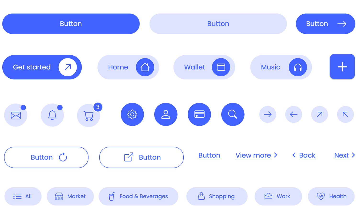
A button, at its core, is a visual cue that signals interactivity. It consists of several key components that contribute to its overall effectiveness. The label (text or icon) clearly communicates the button’s action. The container provides the visual boundary, making it distinct from surrounding elements. Color plays a crucial role in establishing visual hierarchy and conveying meaning. Shape influences its perceived affordance and how users interact with it. Size dictates its prominence and ease of interaction, especially on touch devices. Finally, states (normal, hover, active, disabled) provide visual feedback to the user about the button’s current condition.
Establishing a clear visual hierarchy is paramount. Not all buttons are created equal. Some represent primary actions, while others are secondary or even tertiary. This hierarchy should be visually communicated through size, color, and placement. Primary action buttons, such as "Submit" or "Add to Cart," should be the most prominent, drawing the user’s eye and encouraging immediate action. Secondary buttons, like "Cancel" or "Edit," should be less visually assertive but still clearly identifiable. Tertiary buttons or links, often used for less critical actions or navigation, can be more subtle. This hierarchy guides users through the interface, ensuring they understand the most important actions available to them.
Key Principles of Effective Button Design
Several core principles underpin the creation of effective buttons:
- Clarity: The button’s purpose must be immediately obvious. The label should be concise, unambiguous, and use strong action verbs. Avoid jargon or overly technical terms. For instance, instead of "Process Request," use "Submit." If using icons, ensure they are universally recognized or accompanied by text labels.
- Discoverability: Buttons should be easily found within the interface. Their placement should be logical and intuitive, following established design patterns. Users should not have to search for them. Consider common conventions, such as placing primary actions at the bottom of forms or in prominent navigation areas.
- Affordance: Buttons must visually communicate that they are clickable. This is achieved through visual cues such as raised appearances, shadows, distinct borders, and clear labeling. The shape and styling should suggest interactivity. A flat, unstyled element might be mistaken for static text.
- Feedback: Users need to know that their actions have been registered. This is achieved through visual feedback provided by button states. When a user hovers over a button, it should change slightly (e.g., color change, subtle animation). When clicked, it should visually indicate that it’s being pressed (e.g., darkening, slight depression). After an action is complete, there should be a clear confirmation.
- Consistency: Maintain a consistent design language for buttons throughout your application. Use the same styles, colors, and behaviors for similar types of actions. This builds familiarity and reduces cognitive load for users. Inconsistent button designs can lead to confusion and errors.
- Accessibility: Buttons must be usable by everyone, including individuals with disabilities. This involves considerations for color contrast, keyboard navigation, and screen reader compatibility. Ensure sufficient contrast between text and background colors for readability. All interactive elements, including buttons, should be focusable via keyboard.
Designing for Different Button Types and Contexts
Buttons can be categorized based on their function and visual presentation. Understanding these distinctions allows for more nuanced and effective design choices.
- Primary Buttons: These represent the most important action on a page or within a specific context. They should be visually dominant and stand out. Common characteristics include bolder colors, larger sizes, and prominent placement. Examples include "Sign Up," "Buy Now," "Submit," and "Add to Cart."
- Secondary Buttons: These represent less critical actions. They are important but do not require the same level of visual emphasis as primary buttons. They often use less saturated colors, outlines, or are placed in less prominent positions. Examples include "Cancel," "Edit," "Save Draft," and "Learn More."
- Tertiary Buttons (or Text Links): These are for the least critical actions or purely navigational purposes. They often appear as plain text with an underline or a subtle hover effect. Examples include "Forgot Password?," "View All," or navigational links within content.
- Ghost Buttons: These buttons have a transparent background with a colored border and text. They offer a more subtle aesthetic than solid buttons and are often used for secondary or tertiary actions where visual clutter needs to be minimized.
- Icon Buttons: These buttons consist solely of an icon, with no accompanying text label. They are effective when the icon’s meaning is universally understood (e.g., a shopping cart icon, a search icon, a gear icon for settings). However, they require careful consideration to ensure discoverability and clarity, especially for users unfamiliar with the icon set.
- Dropdown Buttons: These buttons reveal a list of options when clicked. They are often used in forms or toolbars to present a selection of related actions or choices.
The context in which a button appears also dictates its design. A button within a form will likely be styled differently than a button within a navigation bar or a modal window. Consider the surrounding elements and the overall user flow when making design decisions. For example, a "Close" button in a modal should be easily identifiable and distinct from other actions within the modal.
Typography and Labeling
The text on a button, its label, is arguably its most important element.
- Conciseness: Keep labels short and to the point. Aim for one or two words whenever possible.
- Action Verbs: Use strong, active verbs that clearly describe the action the button will perform. Examples: "Create," "Update," "Delete," "Download," "Send."
- Specificity: Be specific enough to avoid ambiguity. Instead of "Go," consider "Next Page" or "Continue."
- Readability: Choose a font that is legible at various sizes and screen resolutions. Ensure sufficient contrast between the text color and the button’s background.
- Case: Generally, use sentence case or title case for button labels. All caps can be perceived as shouting and can reduce readability.
Color and Visual Design
Color is a powerful tool in button design, influencing perception, hierarchy, and emotional response.
- Brand Consistency: Align button colors with your brand’s visual identity. This reinforces brand recognition.
- Meaningful Color: Certain colors have established associations. Red is often used for destructive actions (e.g., "Delete"), while green can signify success or confirmation. Use these associations judiciously and consistently.
- Contrast: Ensure sufficient contrast between the button’s background color and its text color for readability and accessibility. The Web Content Accessibility Guidelines (WCAG) provide specific contrast ratio recommendations.
- Hierarchy through Color: Use distinct color palettes to differentiate between primary, secondary, and tertiary buttons. Brighter, bolder colors for primary actions, and more muted or outlined styles for less critical ones.
- States and Color: Use color variations to indicate button states. For example, a primary button might be a vibrant blue in its normal state, slightly darker on hover, and even darker when active. Disabled buttons should be desaturated or have a reduced opacity.
Shape and Size
The shape and size of a button impact its perceived affordance, ease of interaction, and visual weight.
- Shape: Rounded corners are generally preferred as they appear softer and more approachable than sharp corners. However, the overall shape should be consistent with the overall design aesthetic. Rectangular buttons with rounded corners are a common and effective choice.
- Size: Button size is crucial for usability, especially on touch devices.
- Touch Targets: On mobile devices, touch targets need to be large enough to be easily tapped with a finger. Apple recommends a minimum touch target of 44×44 points, and Google recommends 48×48 dp.
- Visual Prominence: Larger buttons naturally draw more attention. Use this to your advantage for primary calls to action.
- Proportion: The button size should be in proportion to its surrounding elements and the overall layout. Overly large buttons can disrupt the visual flow, while too-small buttons can be difficult to interact with.
States and Feedback Mechanisms
Providing clear visual feedback is essential for a good user experience. Button states are key to this.
- Default/Normal State: The button as it appears when not being interacted with.
- Hover State: When the user’s cursor hovers over the button. This should provide a subtle visual cue, such as a slight color change, a shadow effect, or a subtle animation. It indicates that the element is interactive.
- Active/Pressed State: When the user clicks or taps the button. This state should provide a clear indication that the click has been registered, often by appearing to be pressed down, darkening, or having a more pronounced shadow.
- Focus State: When the button is selected via keyboard navigation. This is crucial for accessibility and should be visually distinct, often through an outline.
- Disabled State: When a button is not currently available for interaction. It should be visually distinct from active buttons, typically by being grayed out, having reduced opacity, or having a faded appearance. The cursor should also change to indicate it’s not clickable.
Beyond visual states, consider other feedback mechanisms such as loading indicators (spinners) for actions that take time, and success or error messages after an action is completed.
Accessibility Considerations for Button Design
Designing for accessibility ensures that your buttons are usable by everyone, regardless of their abilities.
- Color Contrast: As mentioned earlier, sufficient contrast between text and background is vital for users with low vision or color blindness. Use contrast checker tools to ensure you meet WCAG standards.
- Keyboard Navigation: All interactive elements, including buttons, must be navigable using a keyboard. This means they should be focusable and operable using the tab key and enter/spacebar.
- Screen Reader Compatibility: Use semantic HTML elements for buttons (
<button>tag) and provide descriptivearia-labelattributes if the button’s visual label is insufficient or if it’s an icon-only button. - Avoid Reliance on Color Alone: Do not use color as the sole means of conveying information. For example, for error states, use both a red color and an icon or clear text message.
- Sufficient Target Size: As discussed, ensure touch targets are large enough for easy interaction on touch devices.
Best Practices and Common Pitfalls
To summarize and reinforce key takeaways, here are some best practices and common pitfalls to avoid:
Best Practices:
- Use clear, concise, and action-oriented labels.
- Establish a strong visual hierarchy for buttons.
- Provide clear visual feedback for all button states.
- Maintain design consistency throughout the interface.
- Prioritize accessibility in all design decisions.
- Test buttons with real users to gather feedback.
- Use appropriate padding to create comfortable tap targets.
- Consider the overall user flow and context of the button.
Common Pitfalls to Avoid:
- Ambiguous or vague button labels.
- Overuse of buttons, leading to visual clutter.
- Inconsistent button styles and behaviors.
- Lack of visual feedback for button states.
- Poor color contrast, hindering readability.
- Buttons that are too small or too close together on touch devices.
- Reliance on color alone to convey meaning.
- Ignoring keyboard navigation and screen reader accessibility.
- Using generic placeholder text like "Click Here."
By diligently applying these principles and guidelines, designers can create buttons that are not only visually appealing but also highly functional, intuitive, and accessible, ultimately leading to a superior user experience.


