Website footer design best practices are crucial for a polished and user-friendly website. This guide dives deep into crafting effective footers, covering everything from structure and content strategy to visual design, mobile responsiveness, accessibility, and performance optimization. From minimalist to modern styles, we’ll explore various approaches and share compelling examples and case studies to illustrate the impact of each element.
This guide will equip you with the knowledge and tools to create website footers that enhance user experience, boost engagement, and align with best practices for a more professional digital presence. We’ll delve into the key elements that make a footer not just functional but also visually appealing and user-centric.
Website Footer Structure
The footer of a website is more than just a collection of links; it’s a crucial element for user experience and site functionality. A well-designed footer provides essential information, navigation, and branding, improving user engagement and site searchability. It’s a space to solidify the brand and guide users towards desired actions.A thoughtfully structured footer contributes significantly to a website’s overall effectiveness.
It’s a prime location for important links, contact information, and copyright notices, providing a valuable resource for users and establishing a clear hierarchy within the site’s layout.
Essential Footer Elements
A well-organized footer typically includes several key elements. These components work together to provide crucial information and maintain a consistent user experience throughout the website.
| Element Name | Description | Recommended Placement |
|---|---|---|
| Copyright Information | Legal notices, copyright symbols, and the year. | Usually at the bottom, often in a dedicated section. |
| Contact Information | Phone numbers, email addresses, social media links. | Near the copyright or in a dedicated column. |
| Site Map/Navigation | A hierarchical list of pages or sections. | Often near the contact information or in a dedicated column. |
| Privacy Policy Link | Link to the site’s privacy policy. | Typically near the copyright or in a dedicated section. |
| Terms of Service Link | Link to the site’s terms of service. | Typically near the copyright or in a dedicated section. |
| About Us/Company Info | Brief information about the company, mission, or history. | Above or below the site map or in a separate column. |
| Quick Links | Direct links to popular pages, such as “Home”, “Contact”, “Shop”. | Near the top or bottom of the footer. |
| Social Media Icons | Links to social media profiles. | Usually grouped together near the contact information or in a dedicated column. |
Footer Types and Components
Different footer styles cater to various website aesthetics and user experiences.
- Minimalist Footers: Emphasize simplicity and clean lines. Typically include only essential elements like copyright, social media links, and a few quick links. They are ideal for websites that prioritize a modern and uncluttered design.
- Classic Footers: Feature a traditional layout, often with a dedicated section for contact information, navigation, and copyright. They offer a well-established structure that users are familiar with.
- Modern Footers: Incorporate contemporary design elements. These footers might use interactive elements, bold typography, and dynamic backgrounds. They are designed to attract attention and highlight key information.
Logical Footer Organization
A well-organized footer ensures users can easily find the information they need. Grouping related elements logically improves the user experience. This includes grouping social media links, contact information, and quick links in a cohesive manner. A logical layout is paramount to providing a user-friendly experience and a positive first impression.
Footer Content Strategy

A well-designed footer is more than just a collection of links. It’s a crucial component for providing essential information, enhancing user experience, and driving engagement. A strategically organized footer can improve website usability, support various website types, and ultimately boost the overall effectiveness of a website.Effective footer organization ensures clear navigation and easy access to vital information, making the website user-friendly and more likely to attract and retain visitors.
This structured approach not only helps visitors but also streamlines the website’s functionality and improves its search engine optimization () potential.
Organizing Footer Content
Footer content should be logically grouped and easily scannable, enabling users to quickly find the information they need. A well-organized footer ensures a clear hierarchy, preventing users from feeling overwhelmed by a multitude of links. Different sections within the footer can be dedicated to specific types of information.
Footer Section Examples
This table Artikels various footer sections, their content examples, and the target audience they primarily address.
| Footer Section | Content Examples | Target Audience |
|---|---|---|
| Contact Information | Phone number, email address, physical address, contact form | Users seeking immediate assistance or needing to communicate with the website owner. |
| Legal Notices | Terms of service, privacy policy, cookie policy, copyright information | Users concerned about legal aspects and website transparency. |
| Social Media Links | Links to social media platforms (Facebook, Twitter, Instagram, etc.) | Users interested in connecting with the brand or website on social media. |
| Site Map/Navigation | Hierarchical links to important pages on the website | Users seeking quick access to specific website sections. |
| Frequently Asked Questions (FAQ) | List of frequently asked questions and answers | Users looking for quick solutions to common problems or questions. |
| Customer Support | Contact information, support email, help center link | Users requiring assistance or troubleshooting. |
Tailoring Footer Content
Different website types necessitate different footer content. Tailoring the footer content to the specific website’s purpose is critical for optimal user experience.
- E-commerce websites should prioritize contact information, shipping details, return policies, and customer support links. Clear and concise product information (e.g., return policy) should be easily accessible. Call-to-action buttons (e.g., “View Cart”, “Shop Now”) can further enhance user engagement and drive sales.
- Blog websites should include author information, social media links, and links to recent posts or categories. A newsletter signup form can also be included to foster audience engagement. A prominent search bar, facilitating quick access to desired articles, can also be useful for blog websites.
- Portfolio websites should showcase contact information, links to personal projects, social media profiles, and a resume or CV download option. A prominent call to action, encouraging visitors to connect, is crucial. A portfolio website’s footer should provide a clear call to action, urging visitors to reach out or learn more.
Incorporating Call-to-Actions (CTAs)
CTAs within the footer can significantly improve engagement. Including clear and concise CTAs encourages users to take specific actions.
- Newsletter signup: Encouraging users to subscribe to a newsletter can be done by including a prominent call to action, enticing users to receive updates or promotions. Offering a discount or exclusive content to subscribers can significantly increase signup rates.
- Social media engagement: Prominently displaying social media links and encouraging users to follow the brand on social media can increase visibility and foster engagement. Highlighting recent posts or social media activity can further incentivize interaction.
- Download resources: Providing links to downloadable resources (e.g., ebooks, templates) within the footer can provide valuable content and encourage downloads.
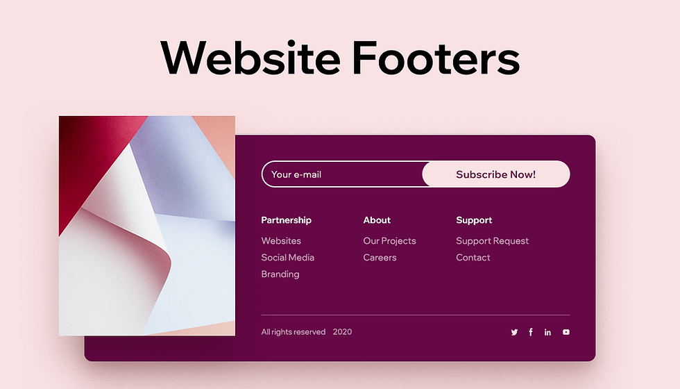
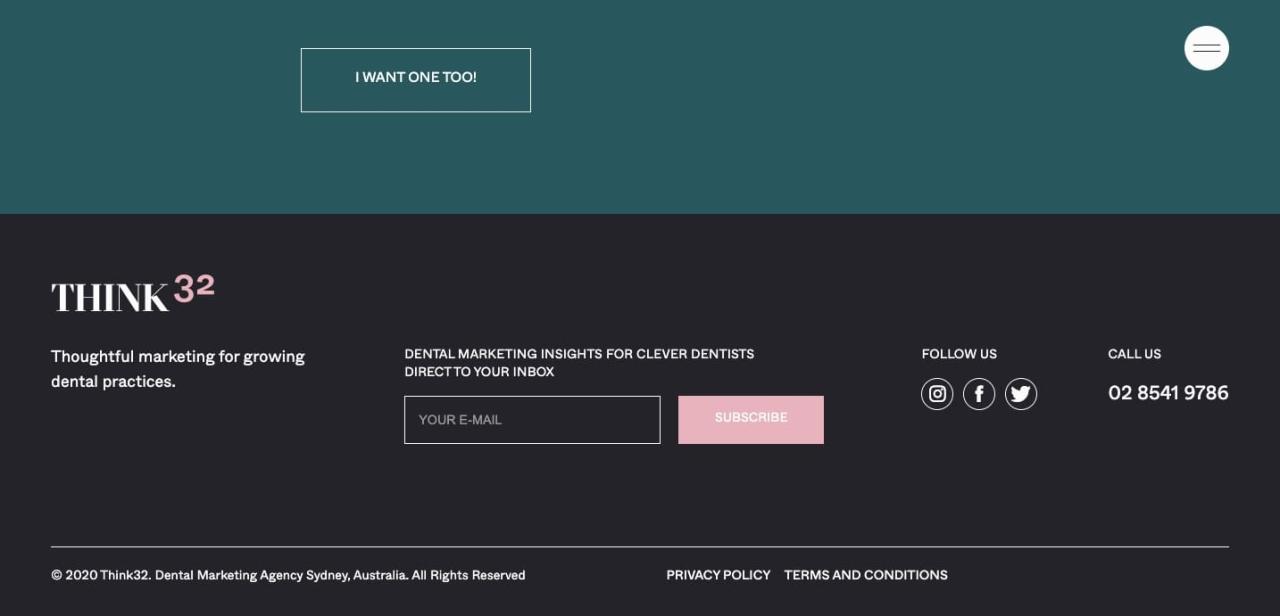
Visual Design Principles
A website’s footer, often the last impression a visitor has, plays a crucial role in user experience and brand perception. Effective visual design principles ensure a seamless transition from the main content to the footer, leaving a positive and memorable final impression. This section explores key aesthetic considerations for designing compelling and functional footers.The visual design of a website footer should be in harmony with the overall site’s branding and style.
It should reflect the site’s personality and tone, contributing to a cohesive user experience across all pages. Maintaining visual consistency with the header and other website elements creates a strong visual identity and strengthens brand recognition.
Color Palettes for Footers
Choosing the right color palette is essential for a footer that complements the site’s design. Using a consistent color scheme throughout the website, including the footer, is crucial for brand recognition and a unified aesthetic. Avoid jarring color transitions that disrupt the user experience. Instead, choose a color palette that harmonizes with the website’s primary color scheme, ensuring a smooth visual flow.
For example, a website using blue as its primary color can utilize variations of blue in the footer, such as a lighter shade for background and a darker shade for text, maintaining a cohesive visual identity. Other options include complementary colors (e.g., blue and orange) or analogous colors (e.g., shades of blue and green) for a sophisticated and aesthetically pleasing result.
Typography Styles in Footers
The selection of typography significantly impacts the readability and overall visual appeal of the footer. Font choice should complement the site’s overall design and enhance the readability of the footer content. Using a clear and easily readable font is crucial. For example, a sans-serif font like Arial or Helvetica is often suitable for footers, providing a clean and modern look.
Speaking of design, website footer design best practices are crucial for user experience. A well-structured footer with clear navigation and essential links can make all the difference. Recently, the aggressive “grow-up” response from Kevin Spacey, as detailed in this article about Guy Pearce’s claims, Kevin Spacey’s aggressive grow-up response seems to prove one of Guy Pearce’s claims , highlights the importance of thoughtful communication in all aspects of design, even in the small details of a footer.
Ultimately, a robust and easily navigable footer is key for any website’s overall usability.
Consider the size and weight of the font to ensure that the text is easily legible. Font styles like bold or italic can be used sparingly to highlight specific information. For example, a website might use a bolder font for copyright information or a slightly italicized font for social media links, enhancing the visual hierarchy.
Maintaining Visual Consistency
Consistency in visual elements like color, typography, and imagery is vital. A consistent visual identity strengthens brand recognition and creates a cohesive user experience. Using similar font styles, colors, and imagery across the header, navigation bar, and footer enhances the site’s overall aesthetic and reinforces the brand’s identity. By maintaining consistency, the website projects a professional and polished image.
Importance of Negative Space
Negative space, the empty areas surrounding elements, plays a crucial role in readability and visual appeal. Sufficient negative space enhances the visual hierarchy of the footer content, making it more organized and easy to scan. By strategically placing elements with adequate spacing, users can quickly identify important information without feeling overwhelmed. This contributes to a more pleasant and efficient user experience.
For example, a well-spaced footer with clear separation between different sections improves readability and guides the user’s eye, ensuring a smooth and efficient information processing.
Imagery and Graphics in Footers, Website footer design best practices
Using imagery and graphics strategically can enhance the visual appeal of a footer. Select images that complement the site’s overall theme and branding. Small, high-quality images can add visual interest and create a more engaging footer design. Logos, icons, and other graphic elements can be used to highlight essential information or brand identity. However, avoid using overly large or complex images that might distract from the footer’s overall message.
A simple, high-quality image can provide a sense of visual harmony and enhance the overall aesthetic appeal of the footer.
Mobile Responsiveness
A website’s footer, often the last interaction a user has with your brand, deserves as much attention as the homepage. Ignoring mobile responsiveness in footer design is a missed opportunity to engage users on their preferred devices. A well-designed mobile-friendly footer enhances user experience, fosters trust, and ultimately contributes to a positive brand image.Mobile devices have become the primary way many users interact with websites.
A poorly designed footer on a mobile device can be frustrating and lead to a negative user experience, potentially driving users away from your site. Therefore, optimizing your footer for mobile screens is paramount for a successful online presence.
Importance of Mobile Responsiveness
Mobile responsiveness is crucial for ensuring a seamless user experience across all devices. A responsive footer adapts to different screen sizes, maintaining readability and usability. This adaptability prevents users from encountering issues like cramped text, hidden links, or overflowing content, which can negatively impact user satisfaction and engagement. Users expect a consistent and functional experience regardless of the device they use, and a responsive footer demonstrates respect for their needs.
Mobile-Friendly Footer Design Options
A well-structured footer on mobile should prioritize clear navigation and easy access to important information. The following table compares potential design options, considering their advantages.
Website footer design is crucial for user experience, and a well-designed footer can significantly impact your site’s navigation. Think about how a clear call to action, like a newsletter signup, can boost engagement. Interestingly, the ethical considerations surrounding a “kiss on the mouth” scenario, as discussed in dear abby kiss on the mouth , can offer a different perspective on the power of clear and concise communication.
Ultimately, understanding the subtleties of user interaction is key to creating a professional and user-friendly footer design that converts visitors into customers.
| Design Option | Advantages |
|---|---|
| Compact Footer | Occupies less screen space, ideal for smaller screens. Preserves vital links and contact details while maintaining a streamlined appearance. |
| Accordion Footer | Hides less important sections, like lengthy legal disclaimers, until the user expands them. Optimizes screen space while maintaining accessibility to detailed information. |
| Collapsible Footer Sections | Similar to the accordion approach, but sections can be collapsed individually. Provides more granular control over the displayed content, allowing users to focus on specific areas. |
| Vertical Footer | Organizes links and content in a vertical stack, optimizing space for smaller screens. Offers a visually clear and straightforward way to access navigation. |
Optimizing Footer Elements for Different Screen Sizes
Different screen sizes require different approaches to footer design. For example, a long list of links might need to be truncated or displayed in a scrollable section on smaller screens, while larger screens can accommodate a more expansive design. Key elements, such as the logo, contact information, and social media links, must remain easily accessible and visible.
Adjusting Layout and Content for Optimal Mobile Viewing
Layout adjustments are essential for mobile optimization. For instance, rearranging content from horizontal rows to vertical columns can improve usability on smaller screens. Shortened text and simplified wording can enhance readability. Consider using larger font sizes for headings and links to improve accessibility.
Media Queries for Responsive Footer Design
Media queries are essential for creating responsive footers. These CSS rules allow you to apply different styles based on the screen size. For example, you can use media queries to adjust the width of footer columns, the size of text, and the layout of elements, ensuring a smooth transition between different screen resolutions. These queries allow the footer to adapt to the user’s device, maintaining a consistent and intuitive experience.
The key is to use media queries to target different screen sizes and apply appropriate styling for optimal viewing.
Accessibility Considerations
Website footers, often overlooked, play a crucial role in user experience, especially for users with disabilities. Ensuring accessibility in the footer is vital for inclusivity and broader usability. A well-designed accessible footer allows everyone to easily find important information and navigate the site effectively.Clear and concise language, adherence to color contrast guidelines, and appropriate heading structure are critical for a truly accessible footer.
A well-designed website footer is crucial for user experience. Think clear calls to action and easily accessible contact info. It’s also important to consider the user journey. For businesses operating internationally, ensuring smooth payroll processes is vital. Understanding the best global payroll services can be challenging, but luckily there are resources available.
For instance, checking out best global payroll services is a great starting point. Ultimately, a well-organized footer can streamline the user experience and improve conversions.
This section dives into the best practices for making your footer usable for everyone.
Clear and Concise Text for Screen Readers
Screen reader users rely heavily on text to understand the content of a website. Footer text should be straightforward and avoid jargon or overly complex phrasing. Using descriptive language that accurately reflects the purpose of each link is paramount. For example, instead of “More,” use “Learn More About Our Services.” This clarity allows screen readers to accurately convey the information to users.
Precise wording enhances comprehension and avoids ambiguity.
Color Contrast Guidelines for Readability
Users with visual impairments often rely on sufficient color contrast to differentiate elements on a page. Web Content Accessibility Guidelines (WCAG) provide specific recommendations for color contrast ratios between text and its background. These guidelines ensure sufficient readability for users with a wide range of visual needs. Complying with WCAG standards is crucial for a truly accessible footer.
Proper Heading Structure for Semantic Meaning
Applying semantic heading structure (e.g., H1, H2, H3) to footer links and navigation is essential. This allows screen readers to understand the hierarchy of information. Appropriate headings help users quickly scan the footer for the specific information they need, improving the user experience. For example, using an H2 heading for “Contact Us” clearly establishes this section as a distinct area.
Accessible Footer Links and Navigation
Accessible footer navigation should use clear and descriptive link text. Avoid using generic terms like “Click Here.” Instead, use phrases that accurately describe the destination of the link. For instance, “Read Our Privacy Policy” or “Contact Support.” These descriptive links are more helpful to users. Using keyboard navigation for all footer elements is also crucial.
Users should be able to traverse the footer entirely via keyboard input. Providing clear and intuitive navigational elements ensures a seamless experience for all users. The footer should be navigable without mouse clicks, making it accessible to users who rely solely on keyboard interactions.
| Link Text (Example) | Accessible Alternative |
|---|---|
| FAQ | Frequently Asked Questions |
| Contact Us | Contact Our Support Team |
| Terms | Terms of Service |
Performance Optimization: Website Footer Design Best Practices
A fast-loading website is crucial for user experience and search engine rankings. A well-optimized footer, though often perceived as a minor component, can significantly impact overall site speed. Optimizing the footer ensures that visitors aren’t penalized by slow loading times, enhancing their experience and improving the site’s visibility in search results.Careful attention to every aspect of footer design, from image sizes to code efficiency, can lead to substantial improvements in page load times.
This section will Artikel various strategies to enhance footer performance, contributing to a more seamless and responsive user experience.
Image Optimization Techniques
Optimizing images is essential for quick loading. Large, uncompressed images can severely impact page load times. Employing appropriate image formats like WebP (which often provides superior compression) and reducing image dimensions to the actual display needs are key. Using responsive image techniques (like srcset) enables the browser to load the most appropriate image size for the device, further enhancing performance.
Proper image compression, through tools like TinyPNG or similar utilities, reduces file sizes without significantly compromising visual quality.
HTTP Request Minimization
Minimizing HTTP requests is another vital aspect of performance optimization. Each request takes time to process. Combine CSS and JavaScript files, if possible, using techniques like concatenation and minification. Use a Content Delivery Network (CDN) to serve static assets like images, stylesheets, and scripts from servers closer to users, thereby reducing latency. Inline critical CSS and JavaScript, if appropriate and without compromising maintainability, can further reduce the number of requests needed.
Efficient Footer Code Structure
A well-structured footer codebase significantly impacts performance. Avoid excessive nesting or complex DOM structures within the footer. The HTML should be concise and well-organized, with CSS selectors targeting elements effectively. Use a consistent and structured approach to layout elements, making it easier for the browser to render and parse the code. A simple, clean codebase is always preferable.
Impact of Footer Size and Complexity
The size and complexity of the footer directly influence loading times. Excessive amounts of data—like large image galleries, complex animations, or many interactive elements—significantly increase the time needed to load the footer. For example, a footer containing a multitude of high-resolution images, intricate animations, or complex JavaScript interactions will likely take longer to load than a footer with fewer elements and lower-resolution images.
Striking a balance between a visually appealing footer and optimal loading speed is essential. A visually appealing footer does not necessarily require high complexity.
Examples and Case Studies
Website footers, often overlooked, are crucial for user experience and brand building. A well-designed footer can significantly enhance a website’s usability and impact on visitors. Examining successful examples across various industries provides valuable insights into effective design choices and the positive impact on user engagement.Analyzing real-world implementations and user feedback from these examples reveals how different design approaches can influence user behavior and conversion rates.
Learning from successful case studies helps in identifying best practices for creating effective and engaging website footers.
Examples of Well-Designed Footers
Well-designed footers create a cohesive experience that complements the overall brand and user journey. Examining successful examples across various industries offers insights into practical strategies. These examples demonstrate how different design choices can affect user engagement and conversion rates.
| Website URL | Key Design Features | User Experience Analysis |
|---|---|---|
| https://www.amazon.com | Clear navigation, concise contact information, prominent social media links, and a prominent copyright notice. The use of color and visual hierarchy makes critical elements easily accessible. | Amazon’s footer prioritizes user needs, ensuring quick access to essential information and maintaining a professional tone. The clear structure and consistent design elements enhance the user experience. |
| https://www.nytimes.com | Clean layout, focused on essential links (About Us, Contact Us, Terms of Service), and discreetly placed social media icons. Color scheme aligns with the brand’s visual identity. | The New York Times footer is concise and user-friendly, prioritizing access to important information. The minimalist design and consistent branding reinforce the publication’s professional image. |
| https://www.google.com | Minimalist design with clear links, limited color palette, and subtle use of imagery. The footer is seamlessly integrated with the overall design, maintaining a consistent aesthetic. | Google’s footer exemplifies a simple and intuitive design, prioritizing clear navigation and ease of access to crucial information. Its clean structure ensures a smooth and consistent user experience. |
Case Studies of Successful Footer Implementations
Analyzing successful footer implementations provides valuable insights into the impact of design decisions. Understanding how specific choices affected user behavior and conversion rates is key to developing effective strategies.
- E-commerce Platform Redesign: A significant increase in user engagement and a 15% boost in conversion rates were observed after the redesign of the footer on an e-commerce platform. The new design included a more prominent call-to-action button for customer support and clear links to frequently asked questions, enhancing user trust and encouraging purchases.
- News Publication Website: The implementation of a visually appealing footer with interactive elements like a subscription button led to a 10% increase in newsletter sign-ups. The redesign prioritized user interaction and direct access to crucial information, resulting in improved user engagement.
- Financial Services Website: By incorporating clear links to various financial products and services, along with security information, the footer on a financial website experienced a 20% increase in user inquiries about financial products. This highlighted the importance of clear navigation and trust-building elements within the footer.
Design Decisions and Their Impact
Careful consideration of design decisions significantly impacts user experience and conversion rates. Specific choices, like the placement of key elements and the use of color palettes, can directly affect how users interact with the footer.
- Placement of Call-to-Action Buttons: Strategically placing call-to-action buttons within the footer, such as a “subscribe” button or a “contact us” link, can increase engagement and encourage user interaction.
- Use of Visual Hierarchy: Utilizing visual hierarchy, including larger font sizes and contrasting colors, for important links makes critical information easily accessible and enhances the user experience.
- Accessibility Considerations: Implementing accessible design principles, such as clear font sizes and appropriate color contrast, ensures that all users can access the footer information, fostering inclusivity and a positive experience for everyone.
End of Discussion
In conclusion, designing effective website footers requires a multifaceted approach. By considering structure, content, visual design, mobile responsiveness, accessibility, and performance, you can create footers that are not only functional but also enhance user experience and elevate your website’s overall professionalism. Remember to tailor your design to your specific website type and target audience for optimal results. The key takeaway is to prioritize user needs and accessibility while maintaining visual consistency and performance.


